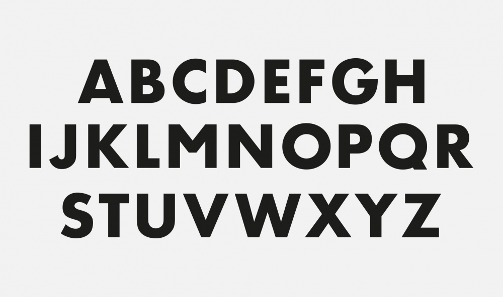
Di MEZZO propose à la location des espaces atypiques pour y organiser des évènements d’entreprise, colloques et manifestations culturelles. Situés à Paris et à Lyon, chacun de ces lieux privatifs est porteur d’une identité historique et artistique forte, unique. Dans le cadre d’une refonte globale de l’identité visuelle de la société, DI MEZZO a fait appel à Studio LWA pour concevoir une toute nouvelle typographie, porteuse du nom de la société. Ce caractère de titrage à forte valeur graphique, à l’accroche facilement lisible, représente désormais l’activité de DI MEZZO avec cohérence, style et modernité.
The French company DI MEZZO offers venues to hold private events, business meetings and exhibitions, conferences and other events. Located in Paris and in Lyon, the venues boast unique features, each with a strong historical and artistic identity. DI MEZZO has chosen Studio LWA to revamp the global visual identity of the company and in this context the agency designed a new typeface used for the brand name of the company. The title font created has a strong graphic presence, its eye-catching design reads easily and generally conjures up the business of the company in a coherent, stylish and modern light.
Di MEZZO propose à la location des espaces atypiques pour y organiser des évènements d’entreprise, colloques et manifestations culturelles. Situés à Paris et à Lyon, chacun de ces lieux privatifs est porteur d’une identité historique et artistique forte, unique. Dans le cadre d’une refonte globale de l’identité visuelle de la société, DI MEZZO a fait appel à Studio LWA pour concevoir une toute nouvelle typographie, porteuse du nom de la société. Ce caractère de titrage à forte valeur graphique, à l’accroche facilement lisible, représente désormais l’activité de DI MEZZO avec cohérence, style et modernité.
Typographie
The French company DI MEZZO offers venues to hold private events, business meetings and exhibitions, conferences and other events. Located in Paris and in Lyon, the venues boast unique features, each with a strong historical and artistic identity. DI MEZZO has chosen Studio LWA to revamp the global visual identity of the company and in this context the agency designed a new typeface used for the brand name of the company. The title font created has a strong graphic presence, its eye-catching design reads easily and generally conjures up the business of the company in a coherent, stylish and modern light.
 LIBRAIRIE GODON
DOUCET LITTÉRATURE
LIBRAIRIE GODON
DOUCET LITTÉRATURE


